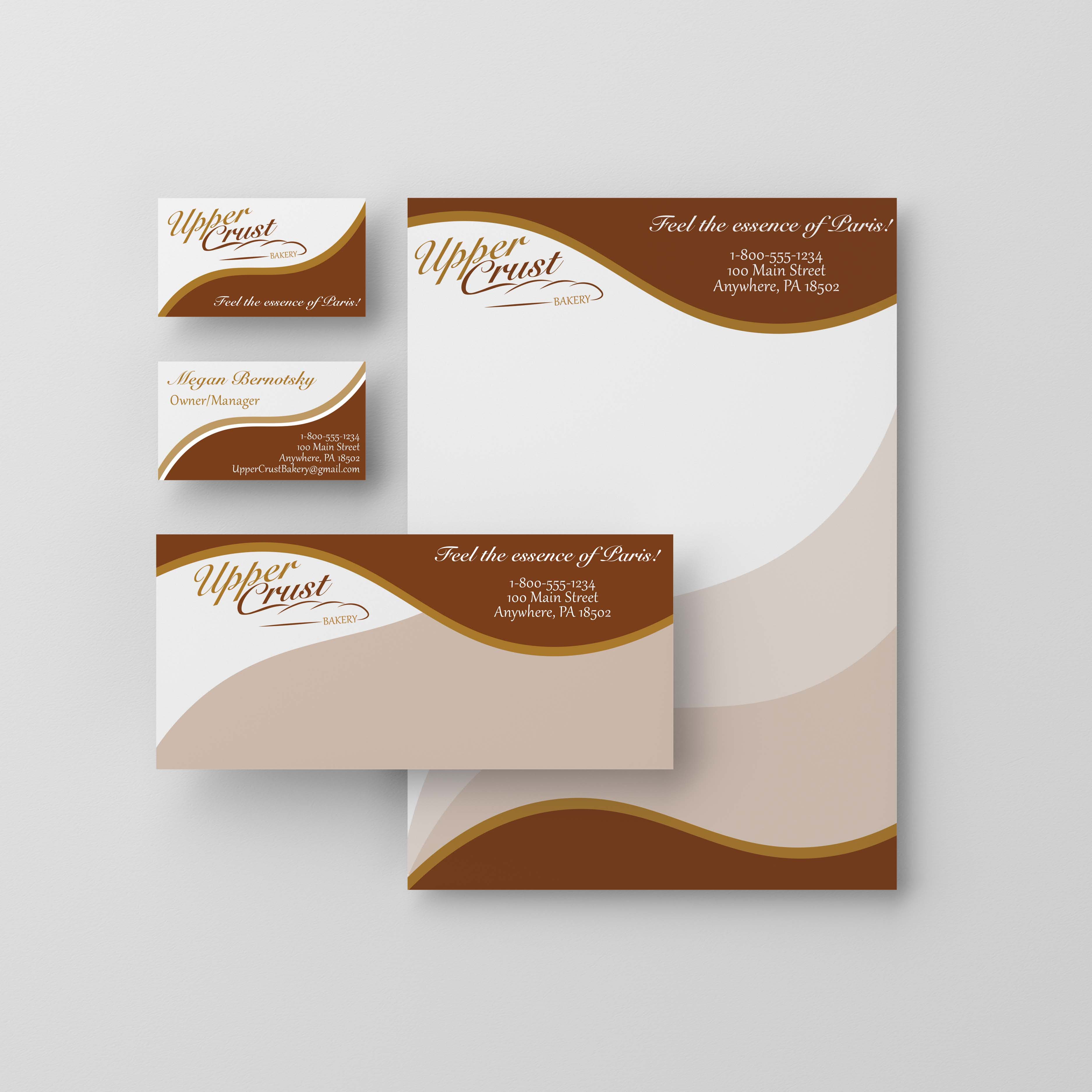
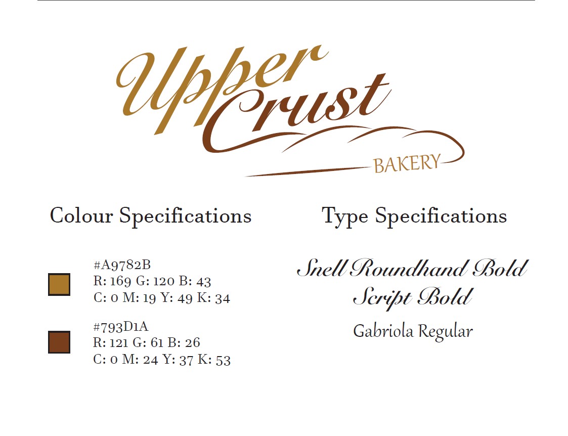
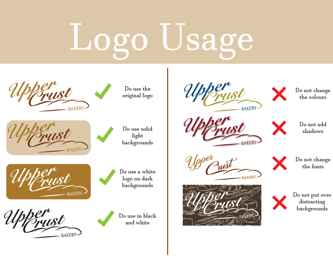
This was a school project where I was provided with details about a fictional small local bakery and was tasked with creating both a logo and mockups of several potential printable designs for business cards, letterhead, and envelopes. We were given just a small description of the business's background and what service they provide. They wanted to stay traditional, but add a touch of modern design to appeal to the masses and grow their business. I used Adobe Illustrator to create these designs and Adobe Photoshop to create the mockups shown here.
Twitch.tv/EntirelyVoid
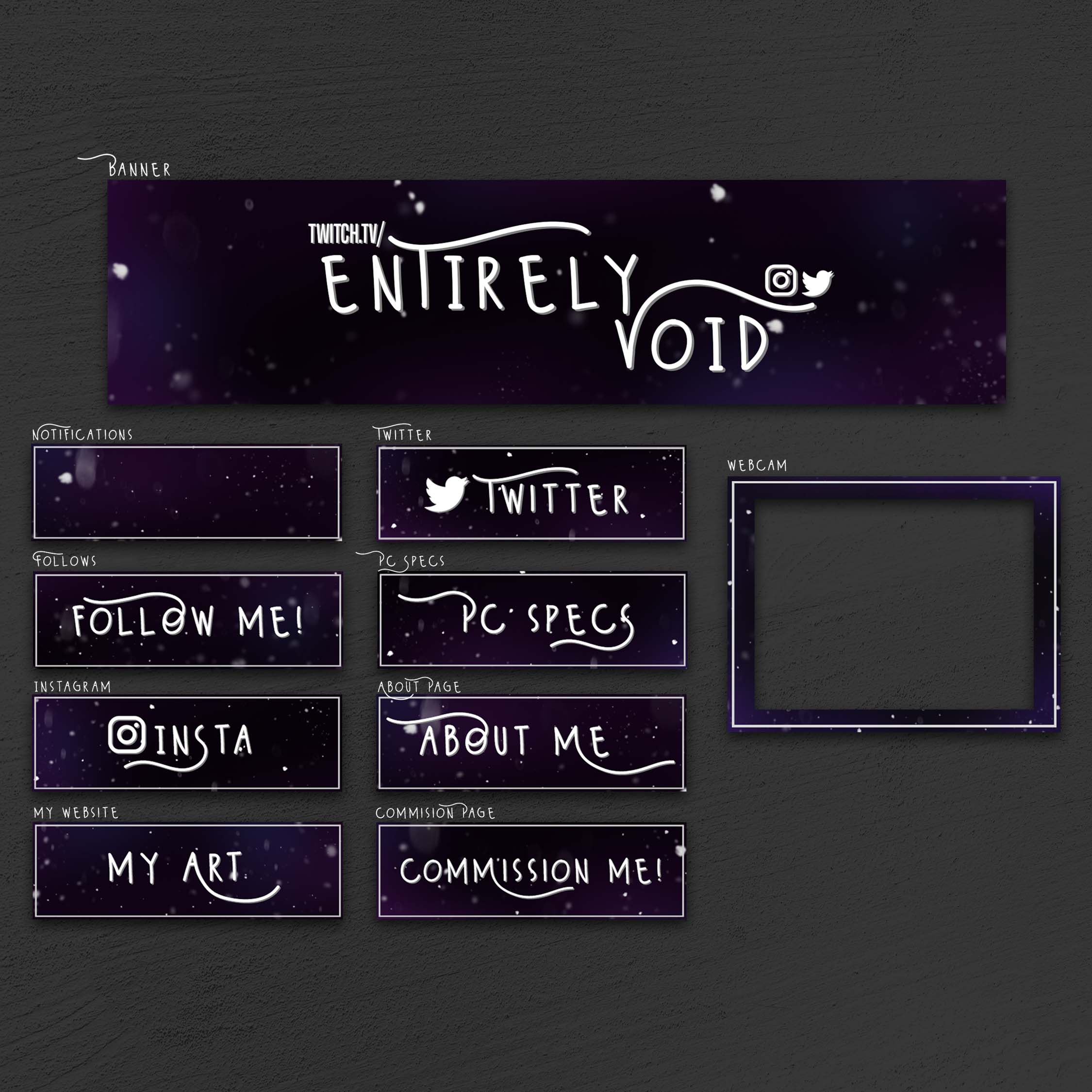
This was a personal project for my Twitch profile. I had to create digital assets to add to both my profile and my video overlay. These assets include a banner, animated Offline and Be Right Back screens, a webcam border, Bio graphics for socials and information categories, and notification boxes. I also created the logo and brand identity through the use of cohesive fonts and background designs. I used Adobe Photoshop to create all of these assets.
Web Design
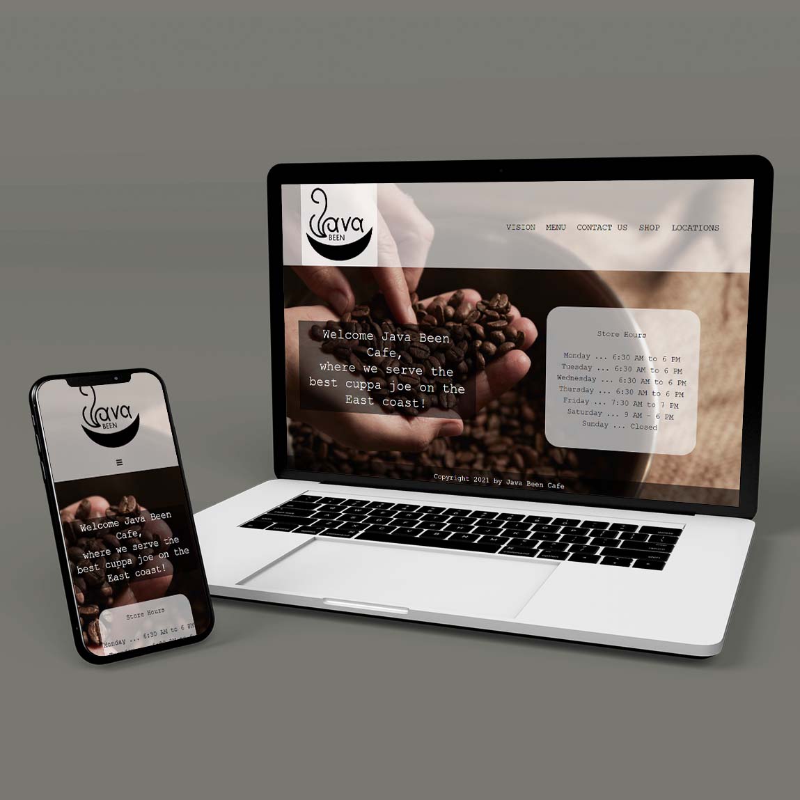
JavaBeen
I was given the logo alone for this school project and was tasked with creating a fully functional and responsive website, including a form with popups and store page with working dropdowns. It was up to each student to decide what type of a store/merchant it was and I chose to do a small local cafe. I used Custom Code in both Bootstrap 4 and Adobe Dreamweaver to create this website.
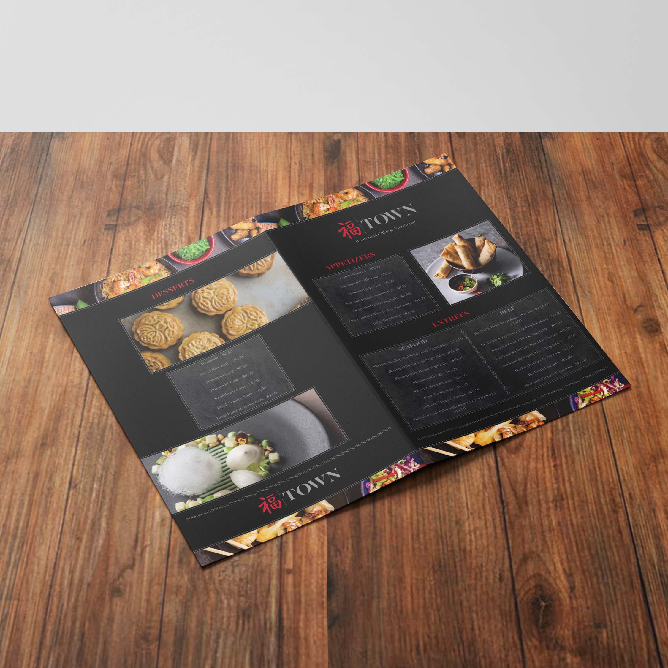
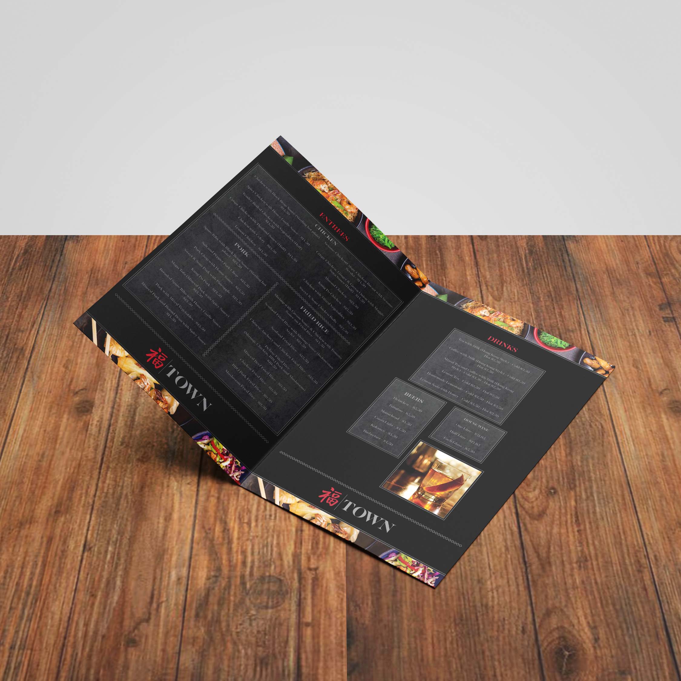
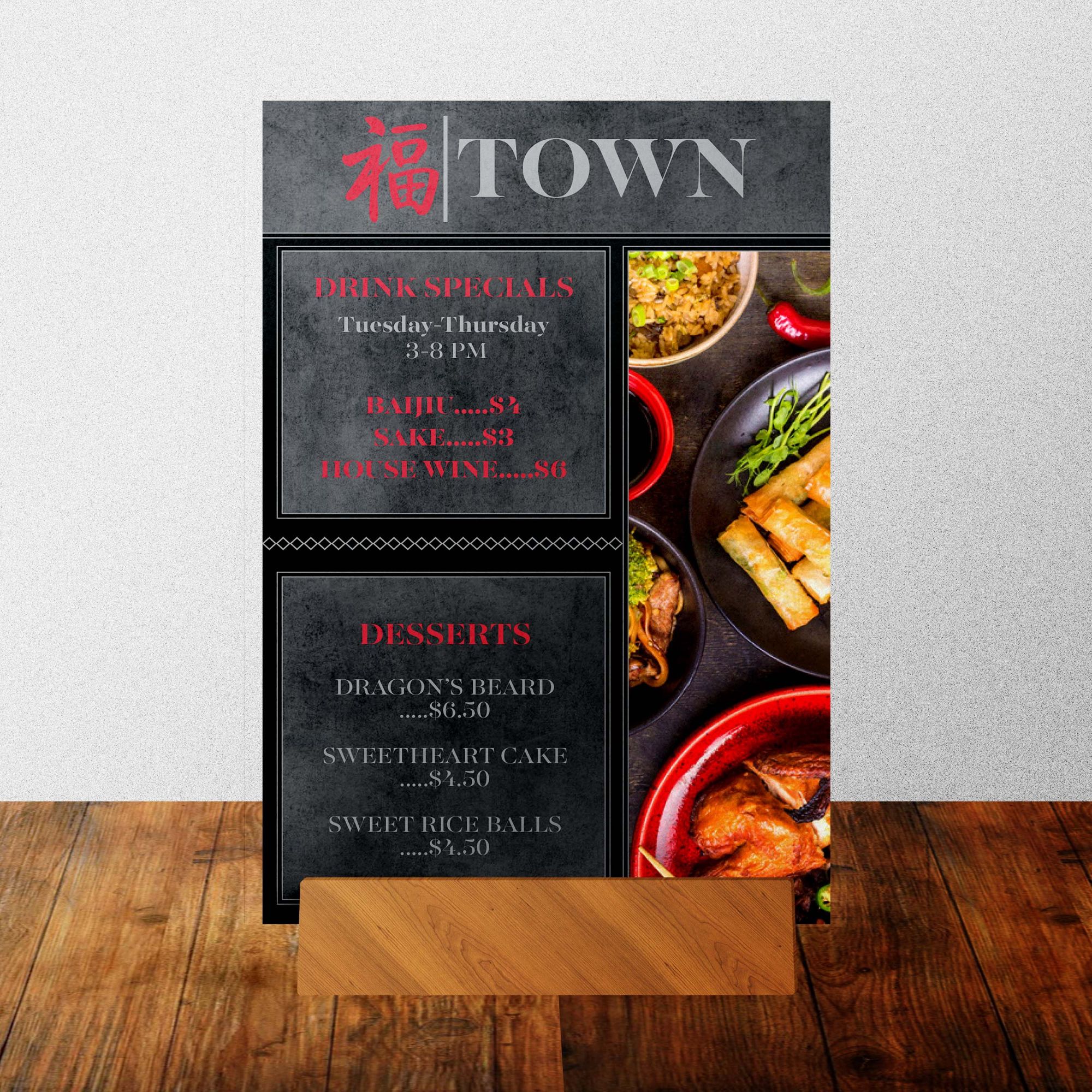
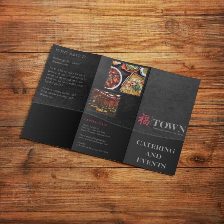
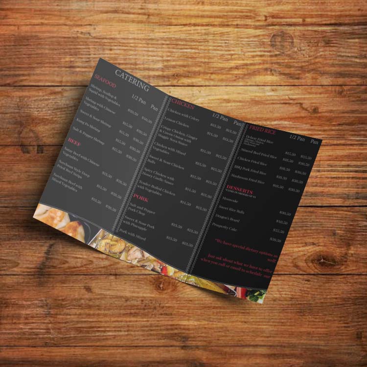
With an existing logo and provided brand identities, this school project was meant to teach us how to work with provide brand identity and set guidelines provided by the client to create printable designs for a restaurant. These designs include a brochure for event catering, a full restaurant menu, and table tents. We were given font types, colour palettes, the logo, and general information about the business to create these designs. I used Adobe InDesign to create these printable designs and Adobe Photoshop to create the mockups shown here.
Amethyst Bay
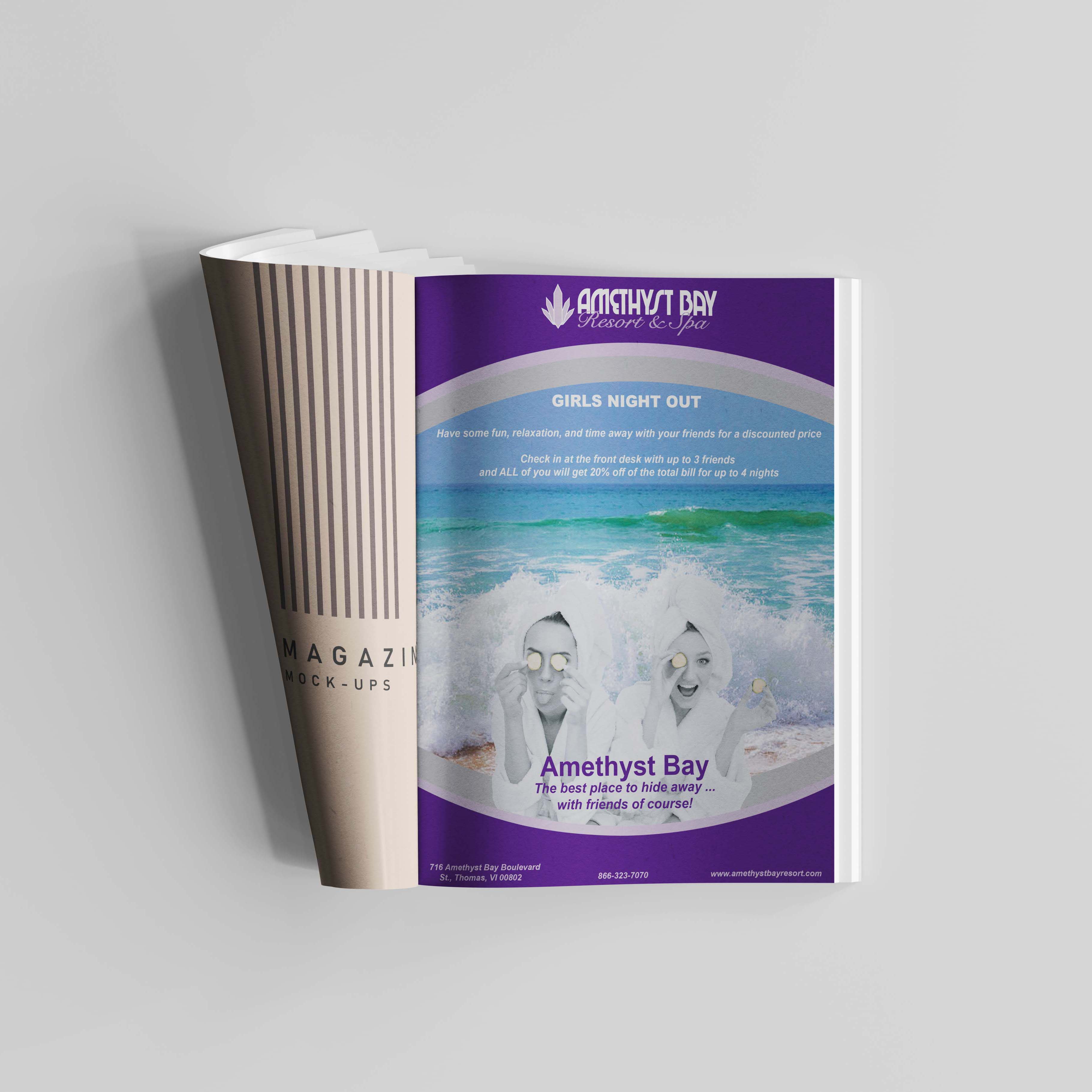
With an existing logo and provided brand identities, this school project was meant to teach us how to work with provide brand identity and set guidelines provided by the client to create a magazine article for this resort. We were given font types, colour palettes, the logo, and general information about the business to create these designs. The goal was to come up with some sort of sale or promotion for the business. I used Adobe Illustrator for the design and Adobe Photoshop to create the mockup.
Typography
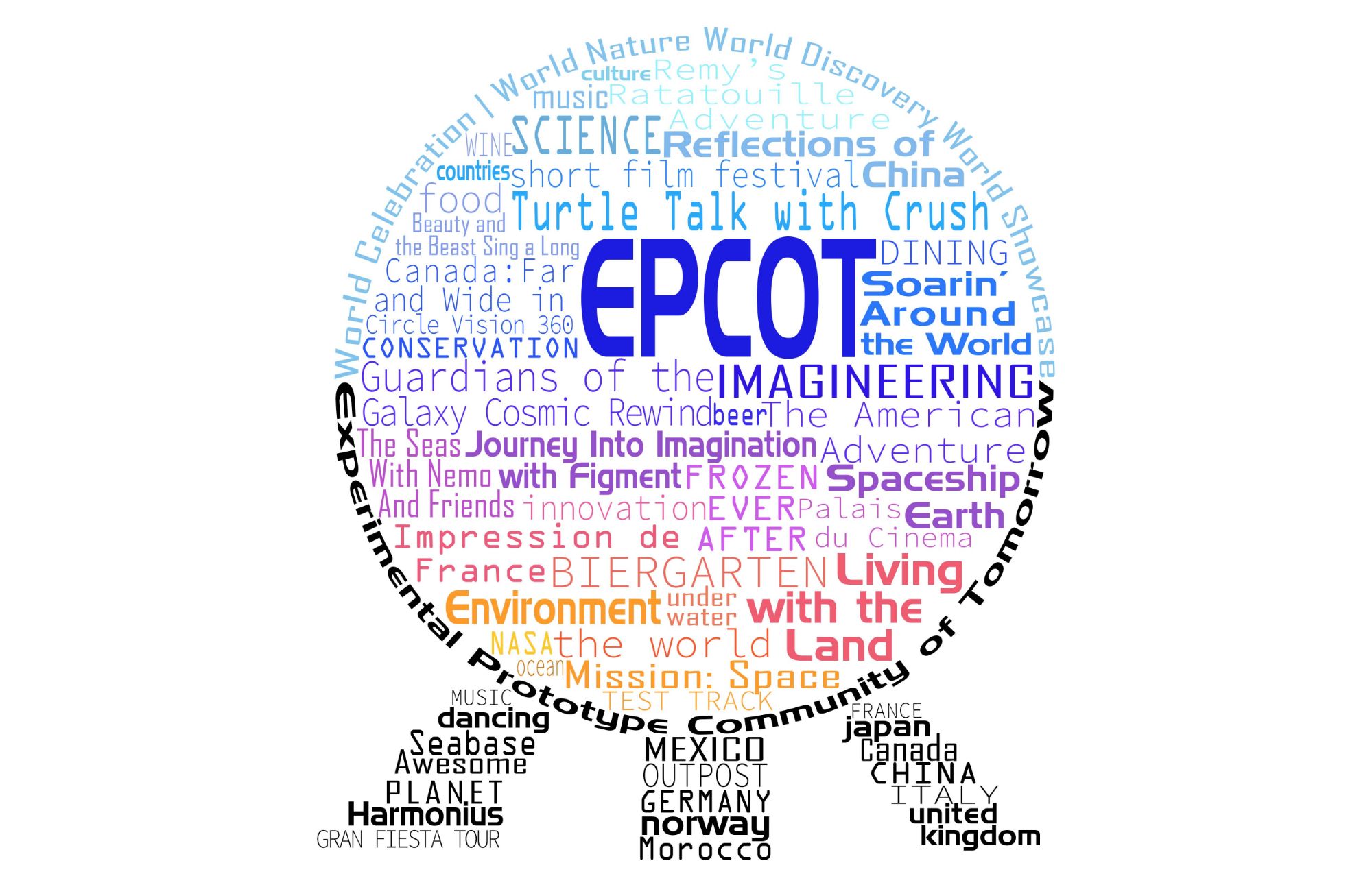
Disney Post Cards
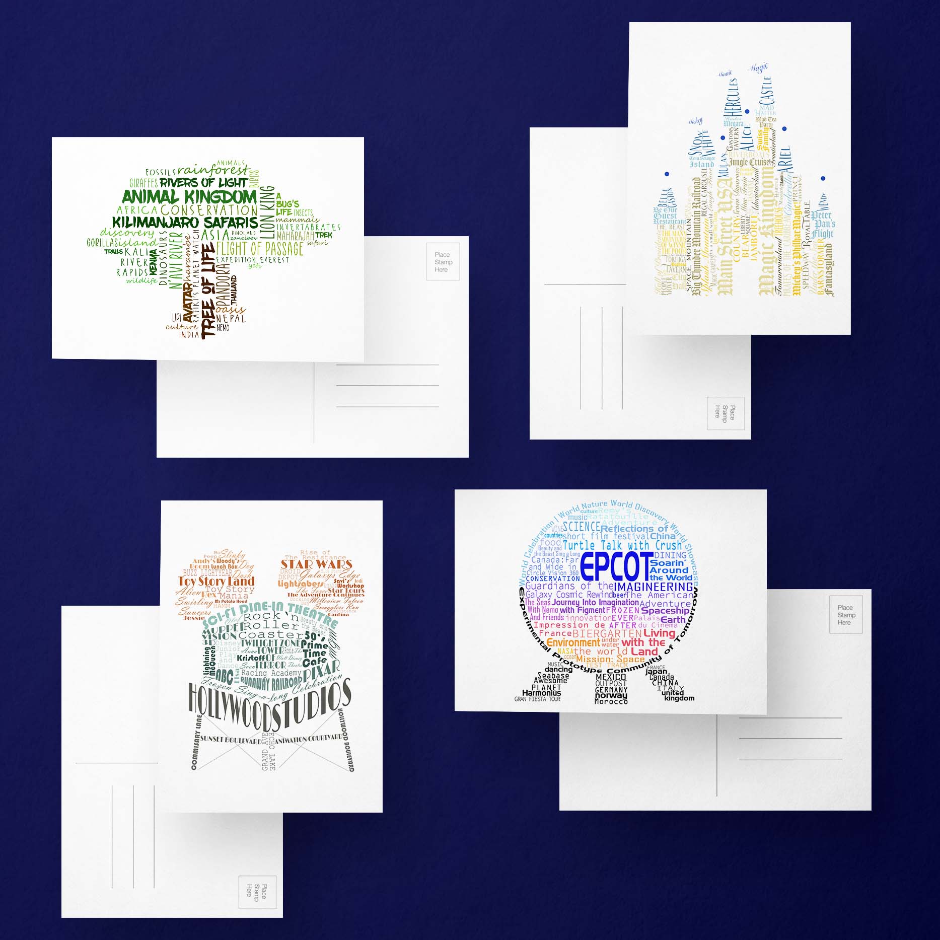
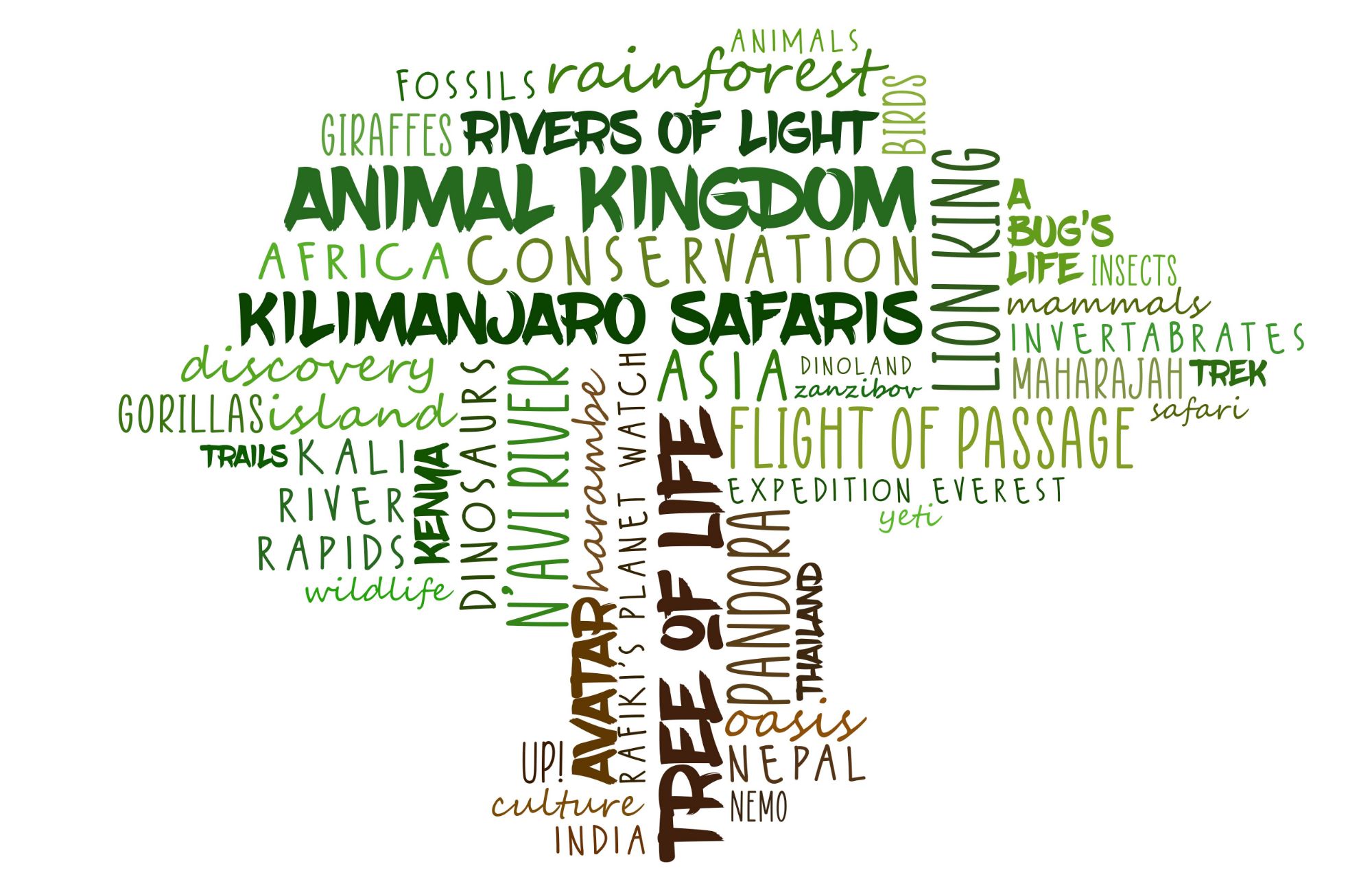
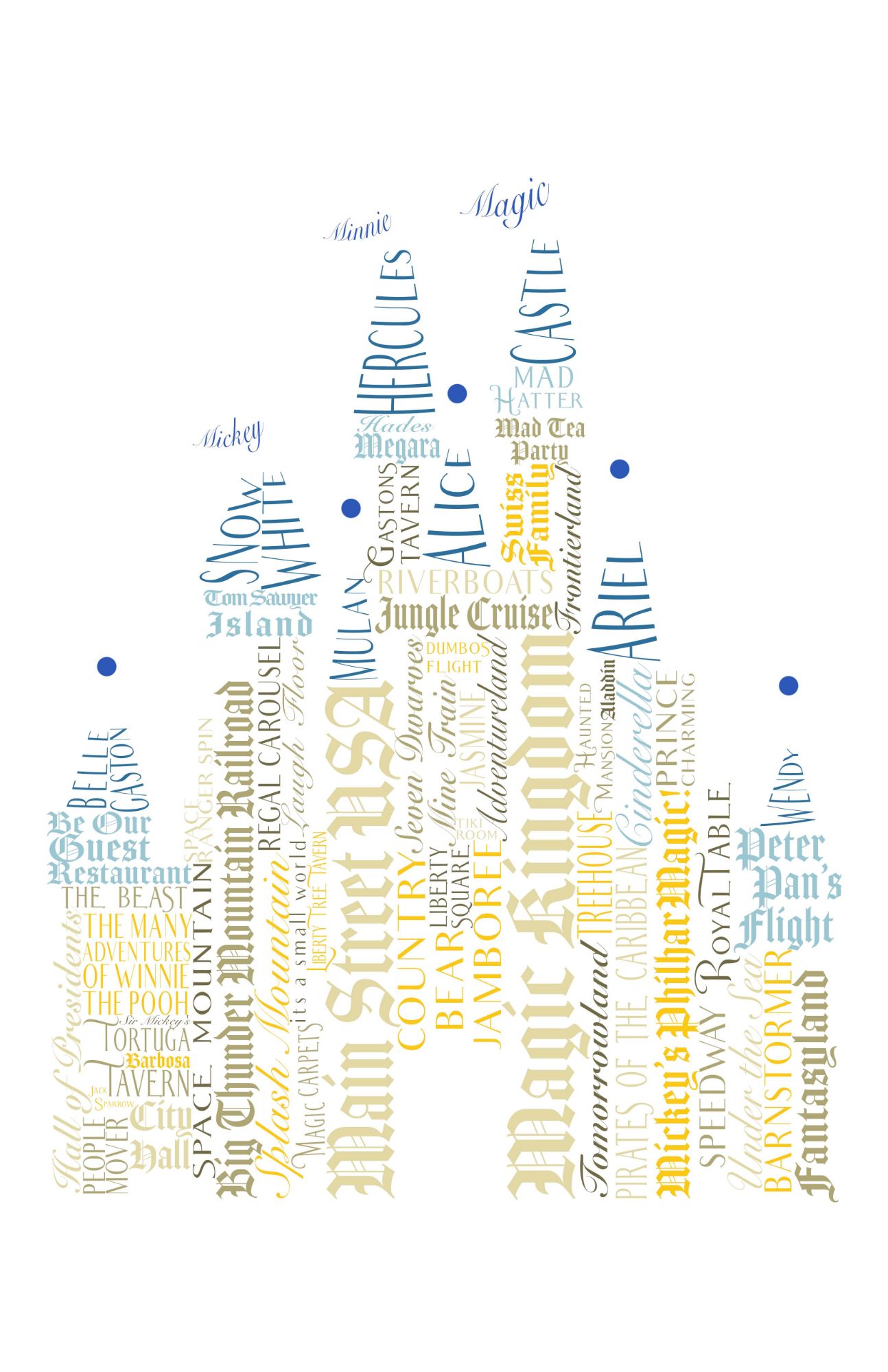
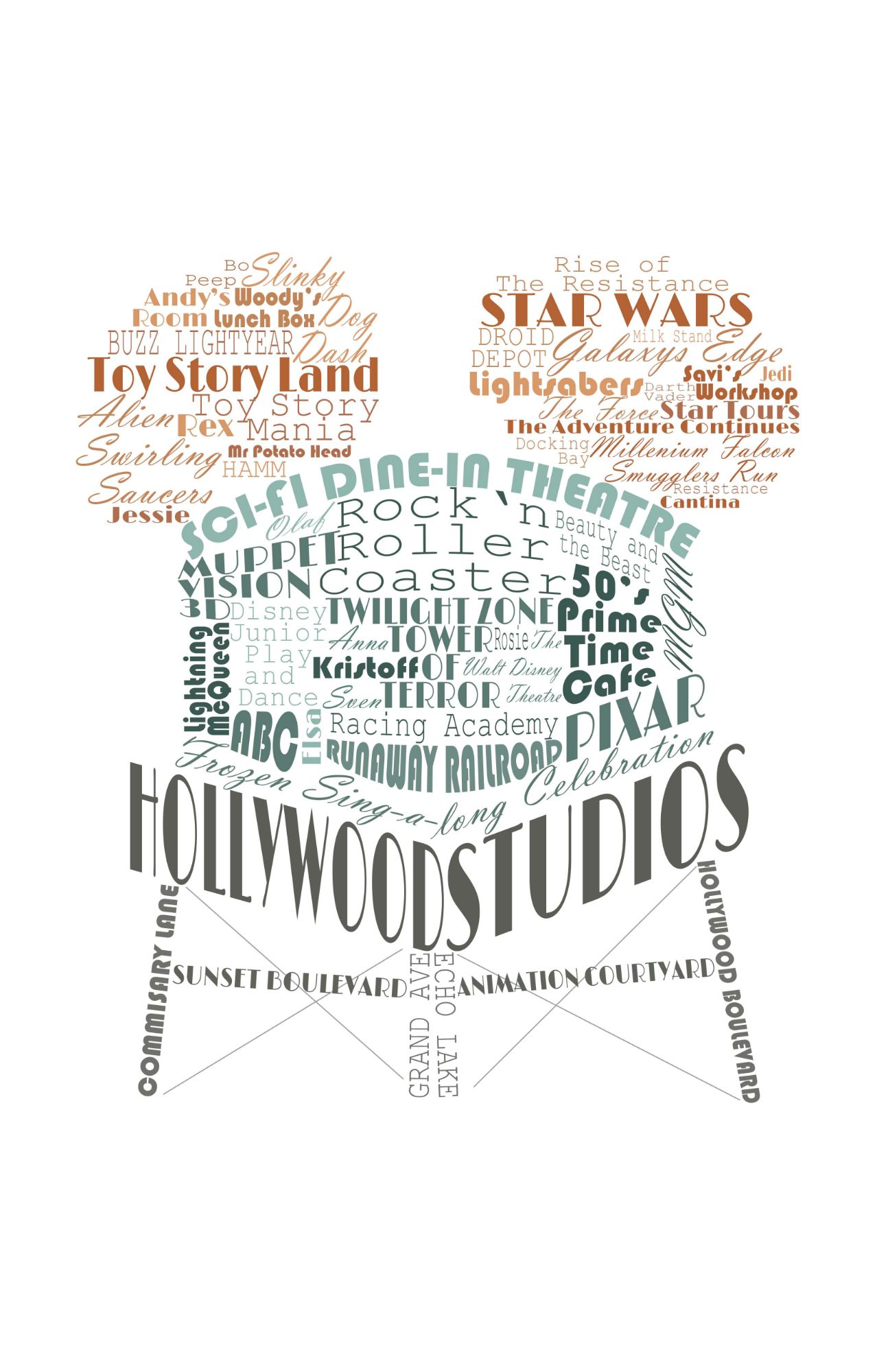
This started as a mini-project for the intro of a typography class, but I decided to continue working on it and create a series of postcards. I used an iconic shape that represents each of the theme parks in Disney World, and utilized the names of rides, areas, and general words that related to each park to create typographic postcard designs. I used Adobe Photoshop for this project.
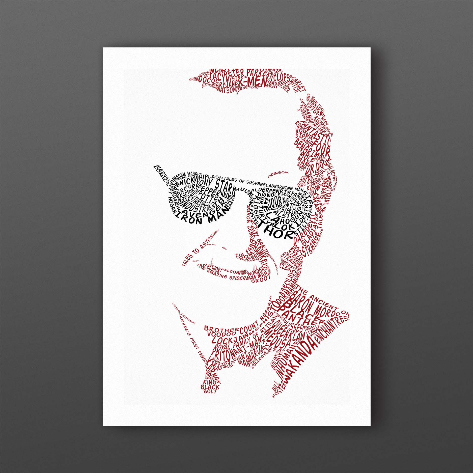
Stan Lee Typography
This was a school project where we took an image of an iconic person and created a portrait of said person out of words related to them. I chose the late Stan Lee, and I used the names of heroes, villians, and Marvel Comics references that he either created, or cocreated. I used Adobe Photoshop for this project.
Print Design
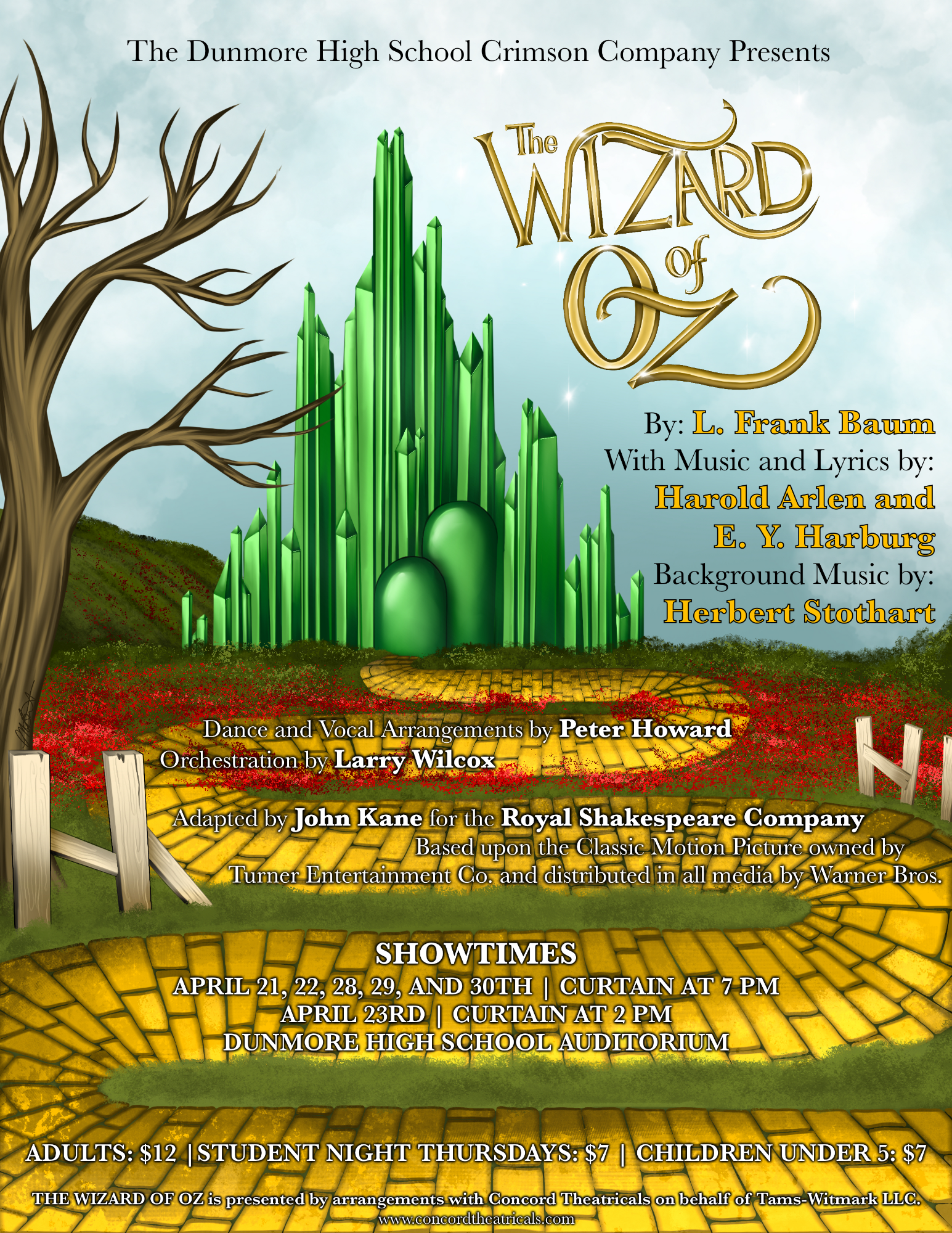
Dunmore High School Crimson Company Poster Design
This was a commissioned piece for my local high school's drama club performance of the Wizard of Oz. I had to follow specific guidelines for the copyrights and purchase agreements that were provided. Each line of text was required to be a certain size to follow these requirements correctly. All of the bakcground illustration was done by me in the Procreate app, along with adding the fonts.
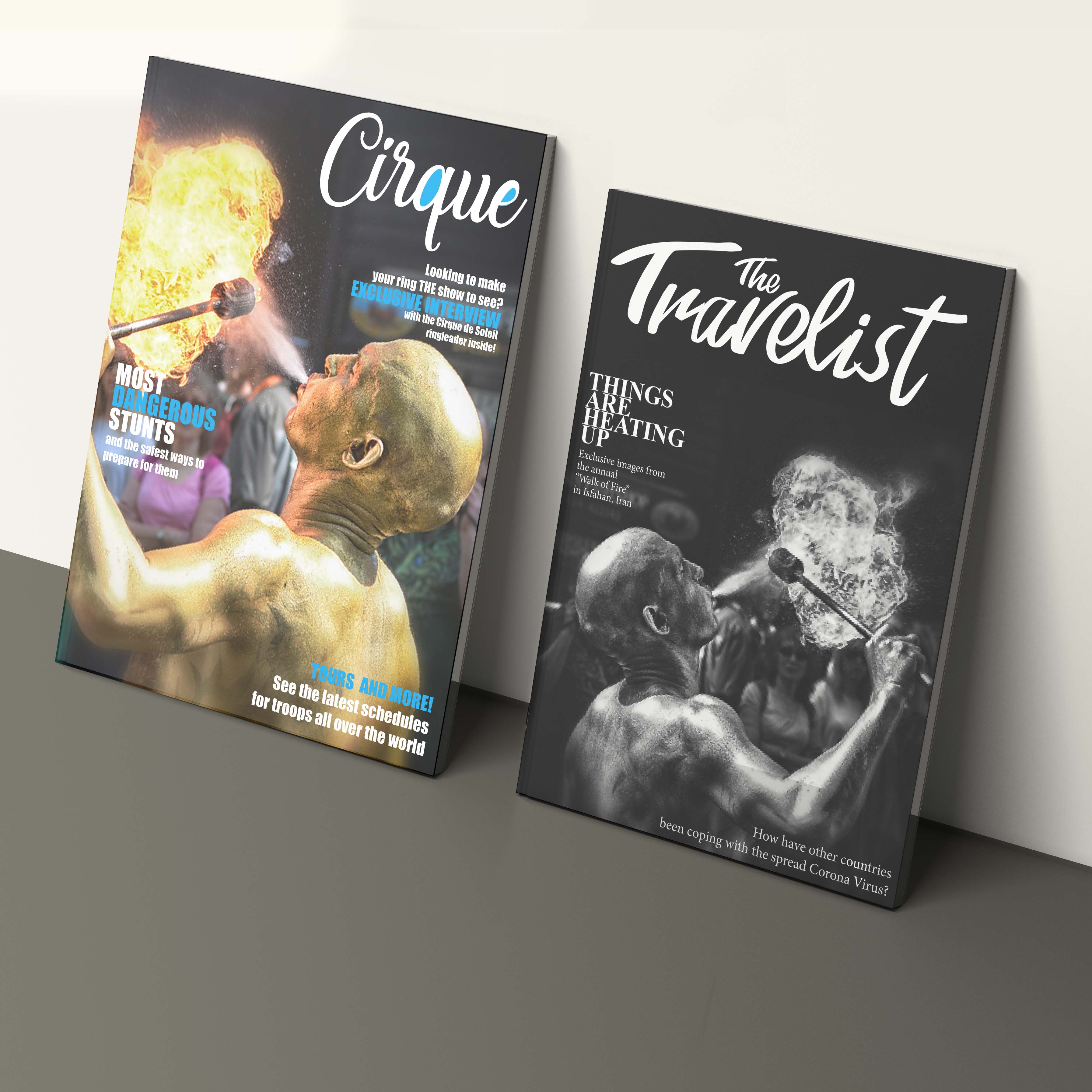
Magazines
This was a small project where we were told to search for a random image in Adobe Stock Images and find one that seemed powerful to us. We then were tasked with the job to create two separate magazine covers with the same image. The main purpose of this was to create the magazines with completely opposite asethetics. My goal was to make one that was very fun and exciting, and the second cover would be very dramatic and serious. For this project I utilized Adobe InDesign.
Calendar
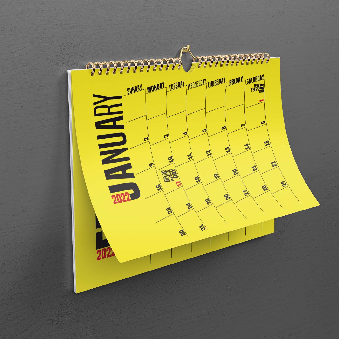
This school project was an exercise with InDesign where we designed a calendar in the style of a famous graphic designer. I chose to use Paula Scher's work with The Public Theater as inspiration for this. I really love how she plays with the balance of fonts and typography to create completely original works. For this project I utilized Adobe InDesign.
Meraki
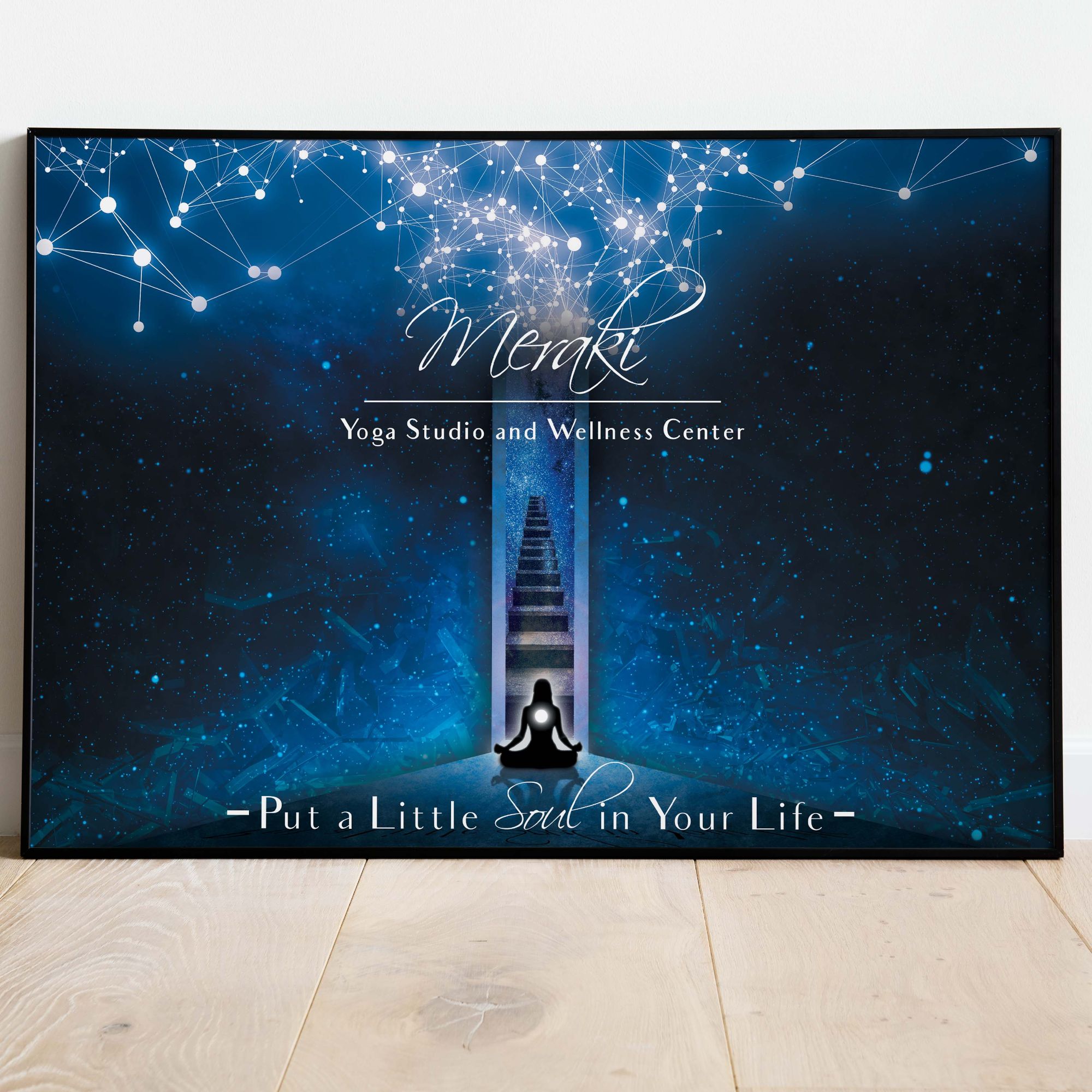
For this project we were meant to create a digital composite collage that would compliment typography work over top. We were also meant to create a poster for a fictitious business of our choice. I chose to create a yoga and wellness studio name Meraki, which is Greek for "putting a little of yourself into everything you do." I created the tagline myself with the company name in mind. I combined multiple images from Adobe Stock Images in Adobe Photoshop to create the final image.